New project dashboard – reports that help you make quality decisions
Overview
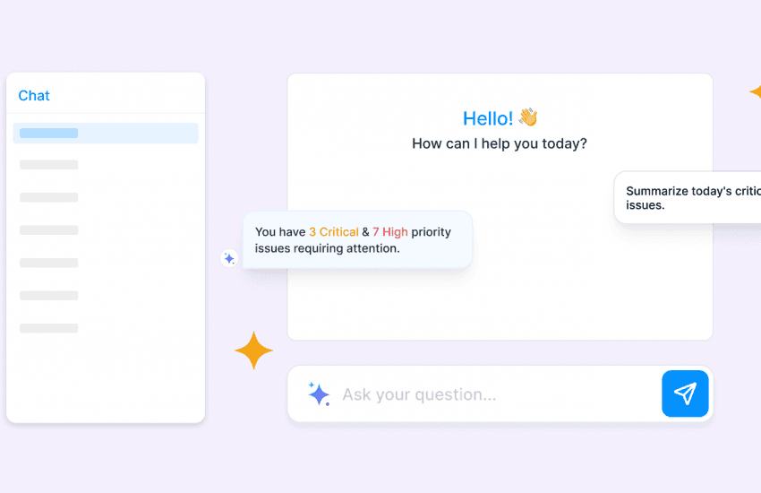
What do the bugs in your code tell you? While you’re busy fixing and closing bugs it’s also important to understand what they say about the quality of your product and your team’s productivity. That’s why we have introduced Bugasura Project Dashboard. It offers a holistic solution for managing and analysing issue-related data within your projects. It empowers you with visual insights to enhance project monitoring and decision-making.
Bugasura Project Dashboard Overview
Bugasura project dashboard has a collection of reports that lend deeper insights into how your product’s quality is impacted. It also shows areas of improvement and bandwidth load on teams.

Bugasura project dashboard introduces a suite of powerful features to streamline your bug management and project analysis. Here is a breakdown of all the charts available per project.
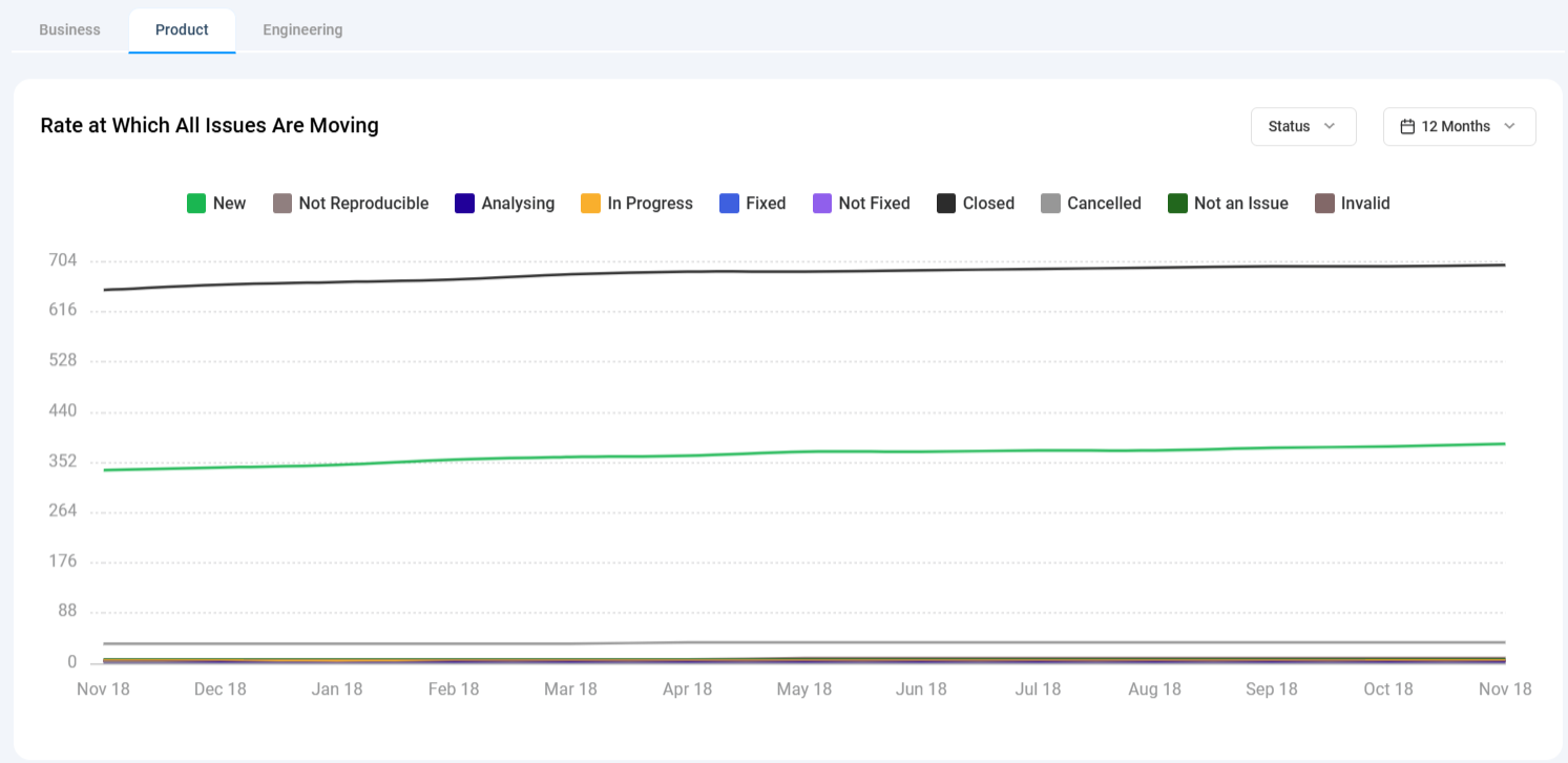
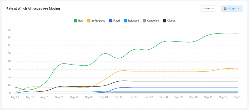
1) Rate at Which All Issues Are Moving: This chart displays the rate at which project issues are transitioning through various statuses, offering a daily or monthly breakdown. It helps track how many issues are in each status on a specific date, providing insights into workflow efficiency.
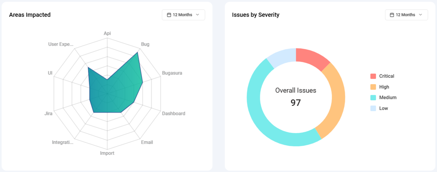
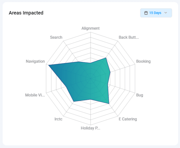
2) Areas Impacted: This chart identifies the areas of your project that are most affected by issues. It categorizes issues into different areas such as UX, performance, and functionalities, providing a visual representation of where the majority of problems lie.
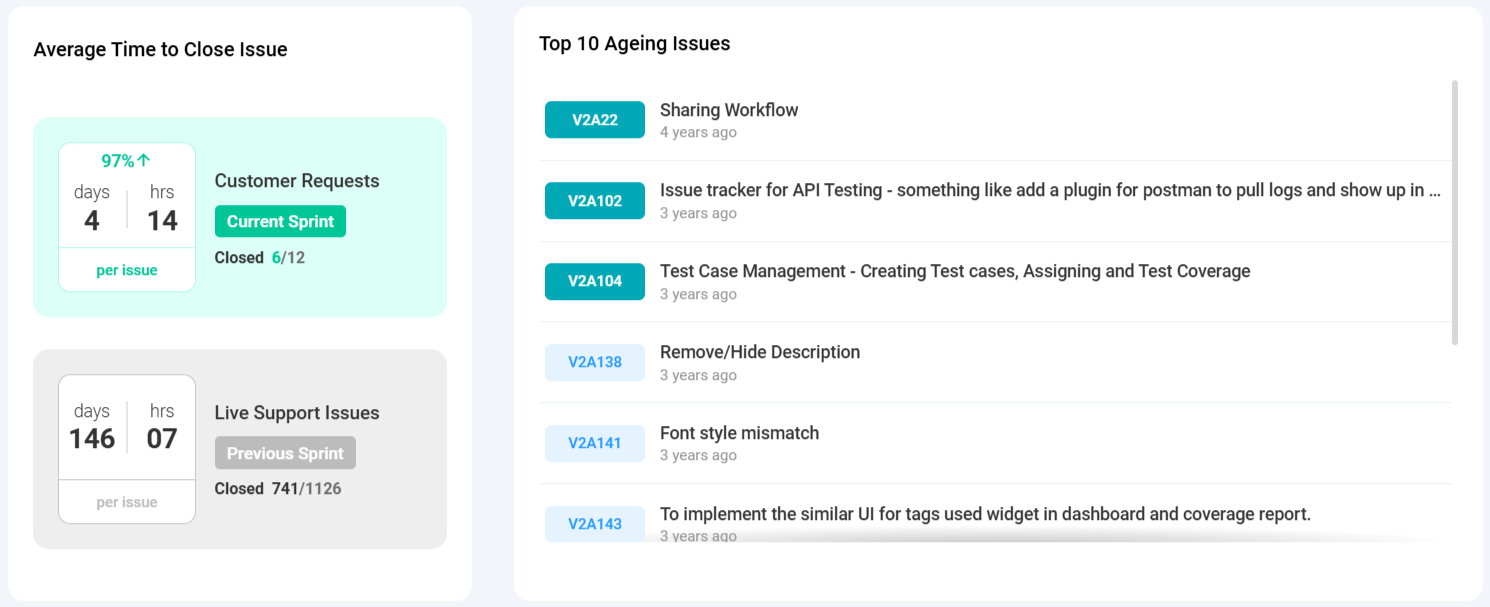
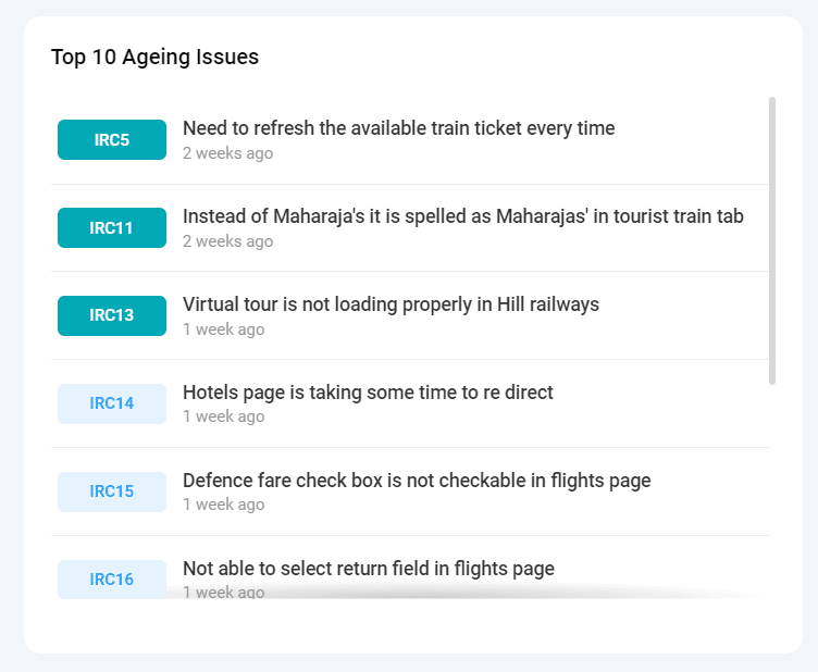
3) Top 10 Ageing Issues: This list highlights the oldest issues that have not yet been resolved or closed. It serves as a reminder to prioritize and address long-standing problems.
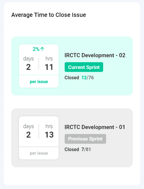
4) Average Time to Close Issue: This chart calculates the average time it takes to resolve bugs within a sprint. It also compares the current sprint’s performance with the previous one, helping you gauge improvements in bug resolution times.
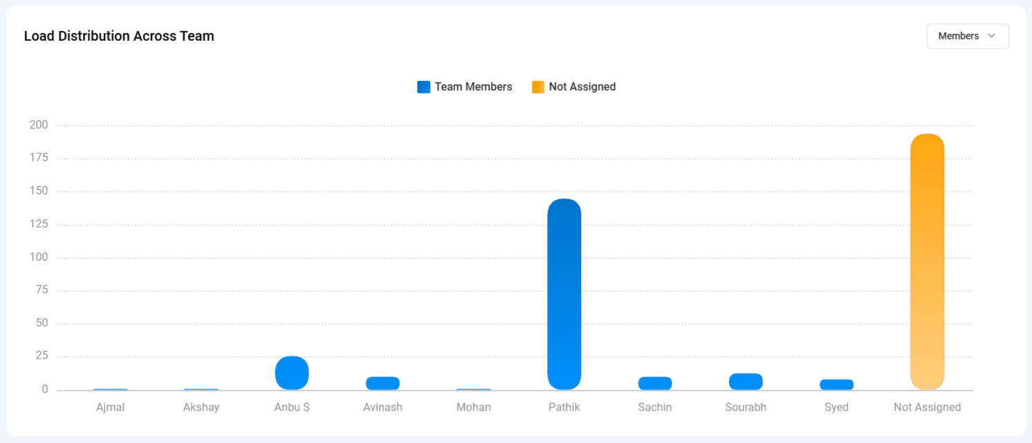
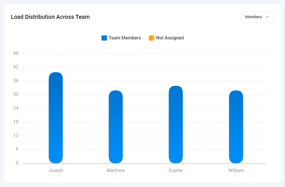
5) Load Distribution Across Team: This chart illustrates the workload distribution among team members by showcasing how many issues are assigned to each team member. It aids in workload management and balancing responsibilities.
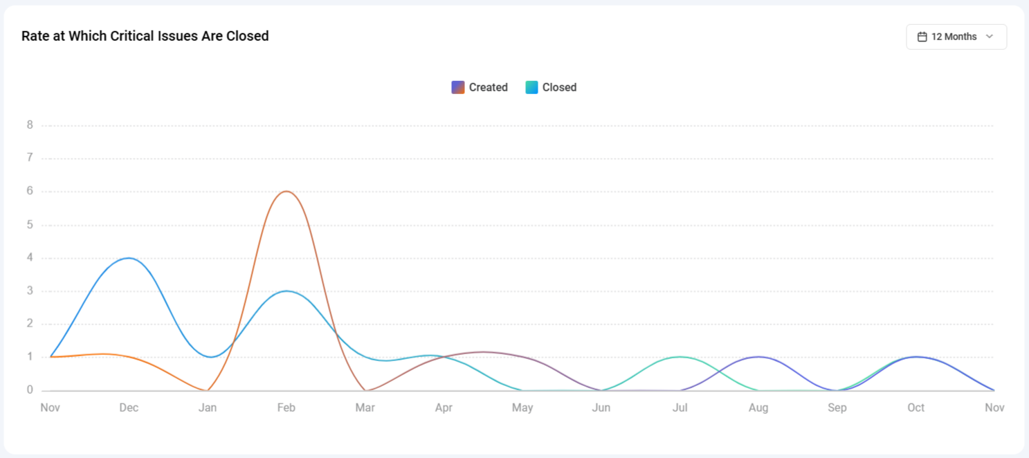
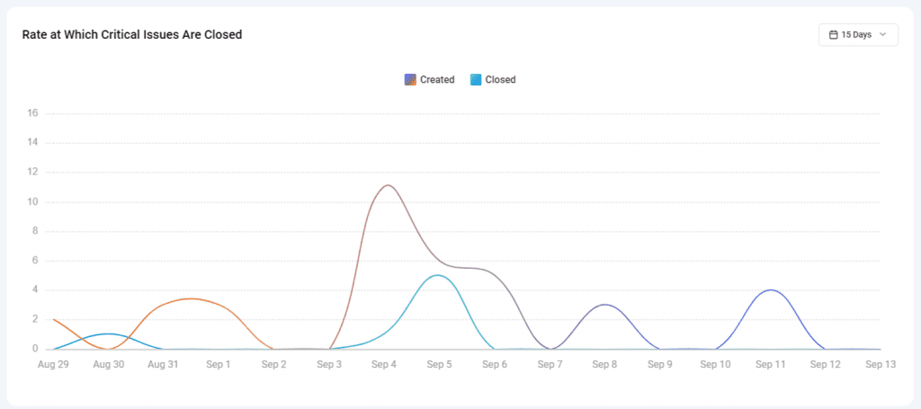
6) Rate at Which Critical Issues Are Closed: This chart tracks the creation and closure rate of critical issues over a specific time interval. It provides valuable insights into how efficiently critical problems are being addressed.
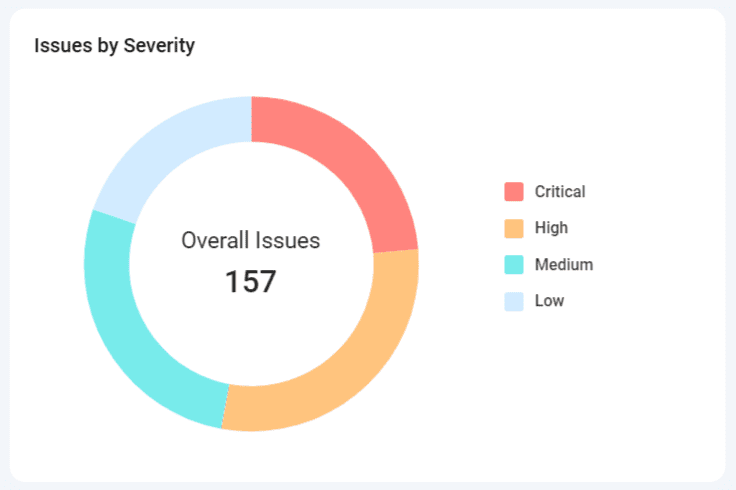
7) Issues by Severity: This chart displays the percentage distribution of issues by severity level, helping you understand the proportion of critical, high, medium, and low severity issues in your project.
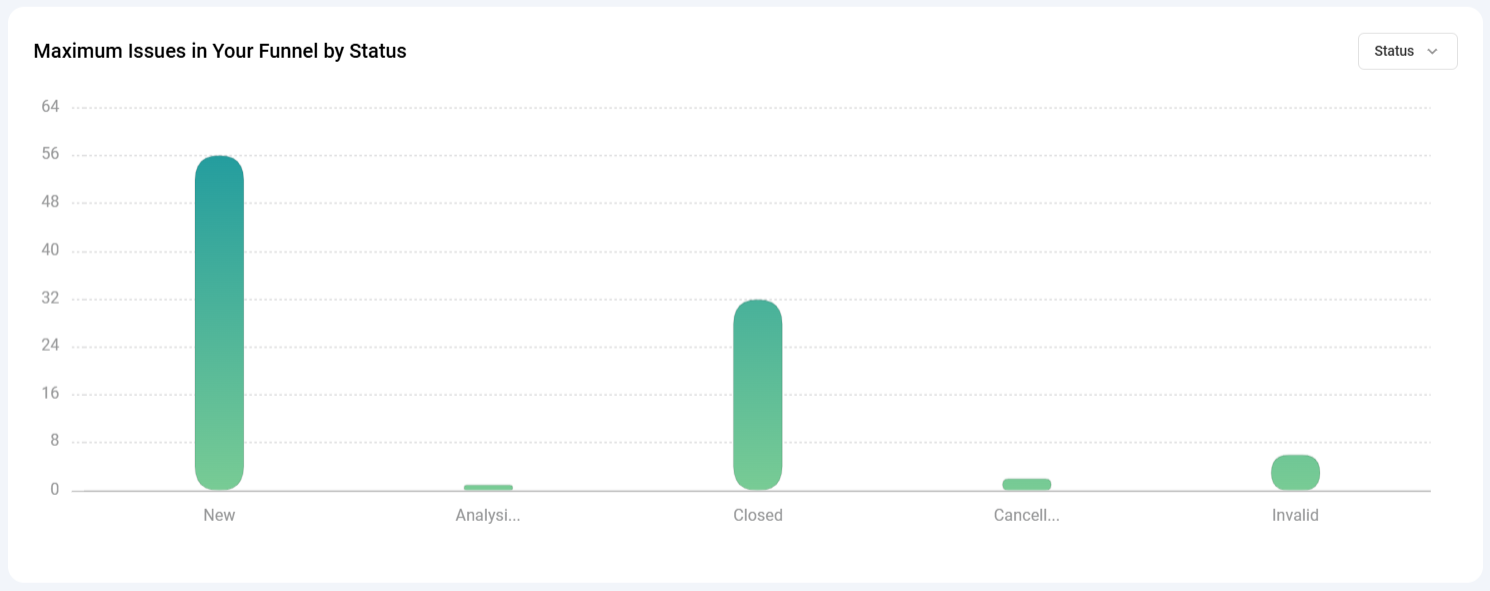
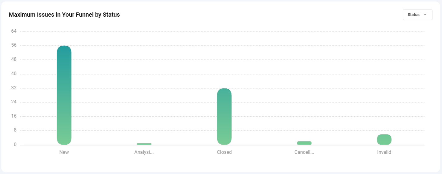
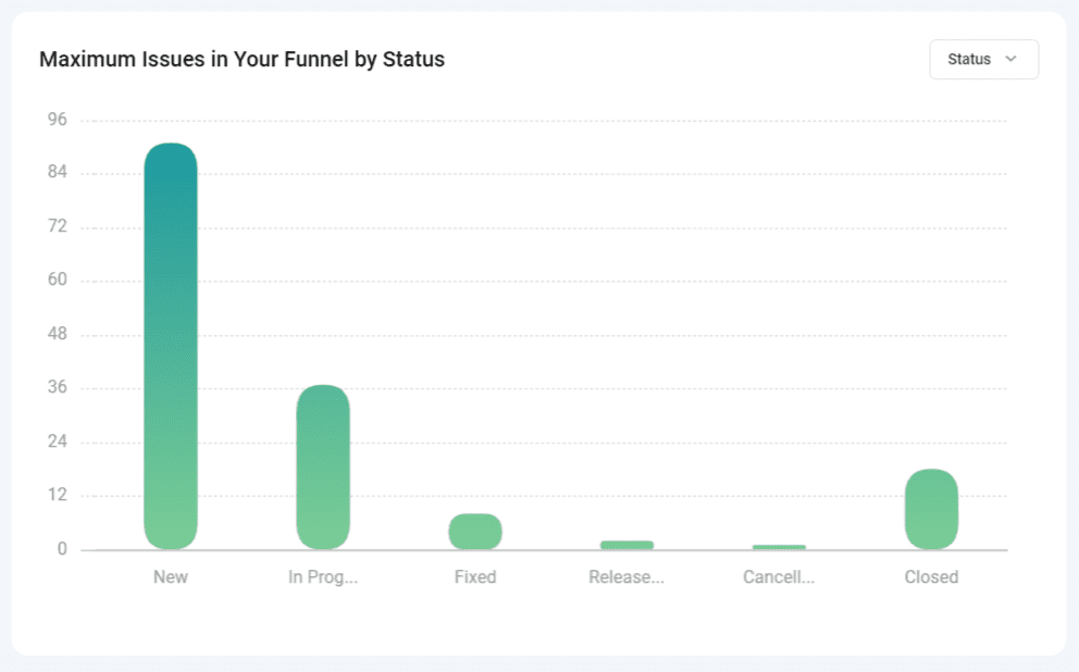
8) Maximum Issues in Your Funnel by Status: This chart shows the number of issues currently in each status category, allowing you to identify bottlenecks and areas where issues tend to accumulate.
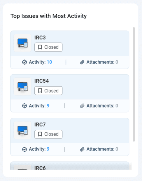
9) Top Issues with Most Activity: This list highlights issues with the most activity, including comments and attachments. It indicates where the most discussion and collaboration are taking place.
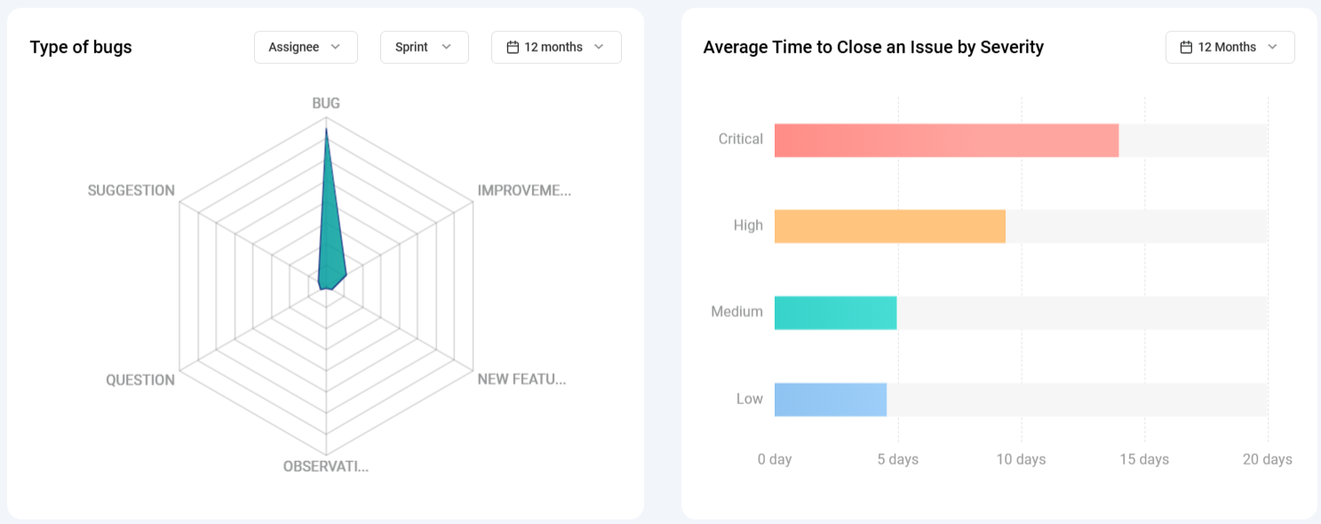
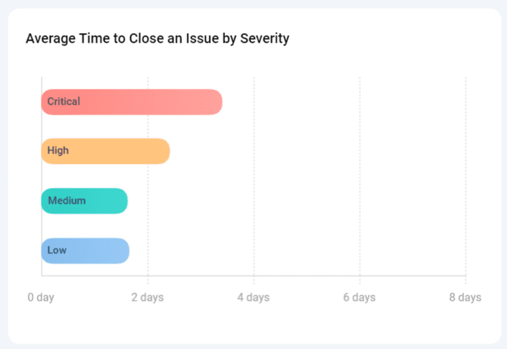
10) Average Time to Close an Issue by Severity: This chart breaks down the average time it takes to close issues based on their severity levels, including critical, high, medium, and low. It helps assess whether certain types of issues require more time for resolution.
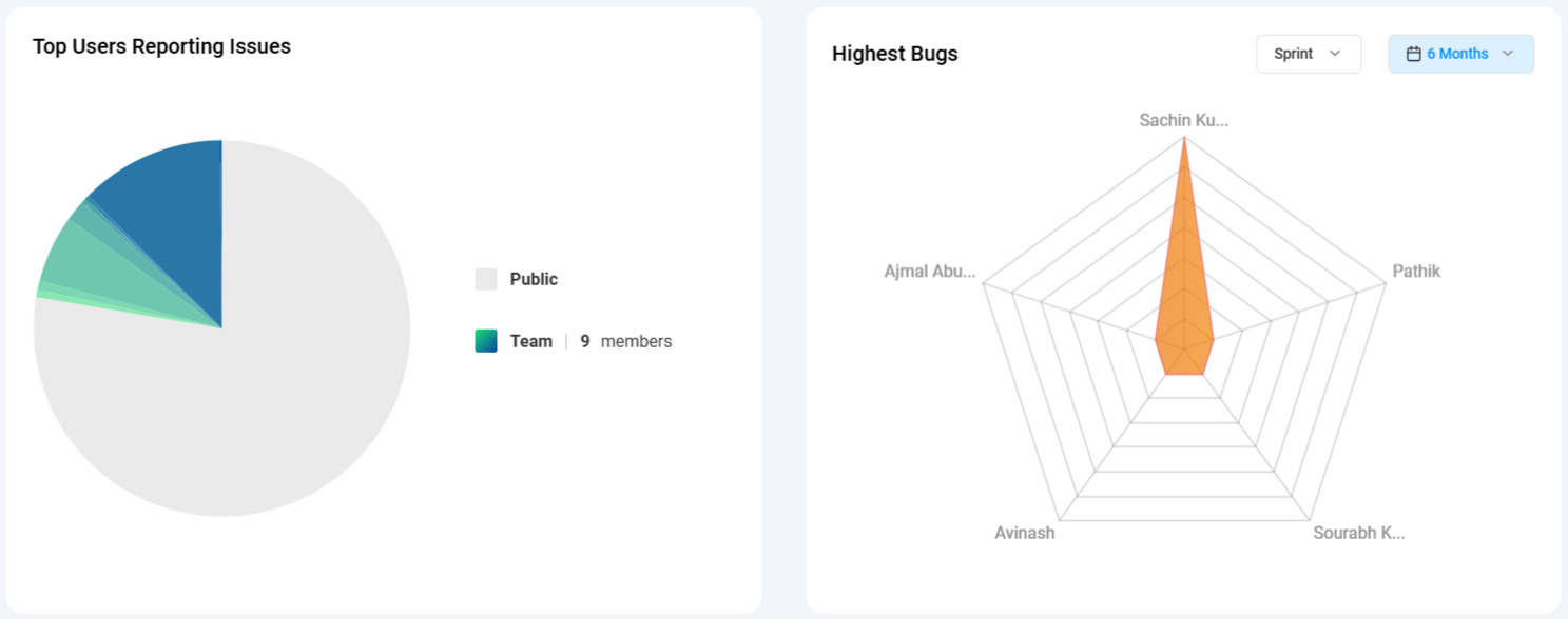
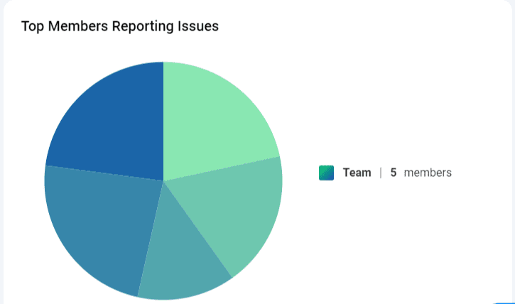
11) Top Members Reporting Issues: This graph provides insights into the contribution of each team member by displaying the number of issues created by individual users. It acknowledges the team’s efforts in issue reporting.
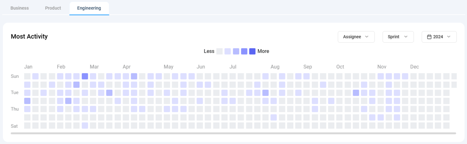
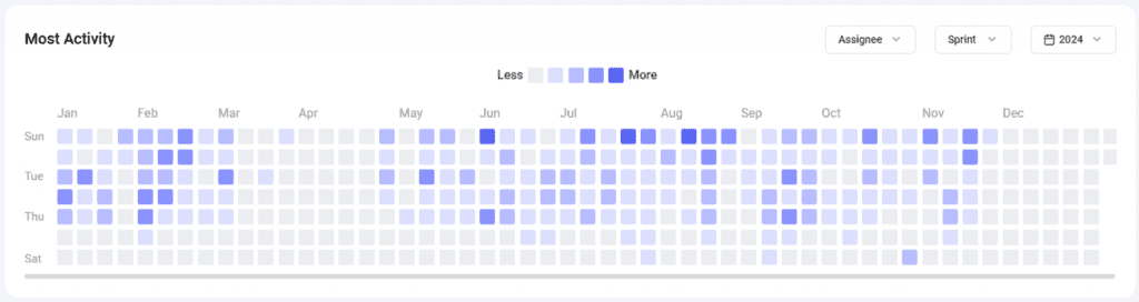
12)Most Activity: This graph provides insights into activity levels based on comments made on issues. The graph shows months on the X-axis and days of the week on the Y-axis. Each box represents activity levels on a specific day, color-coded from less to more based on activity. Hovering over each box shows a tooltip with the exact date and activity count.
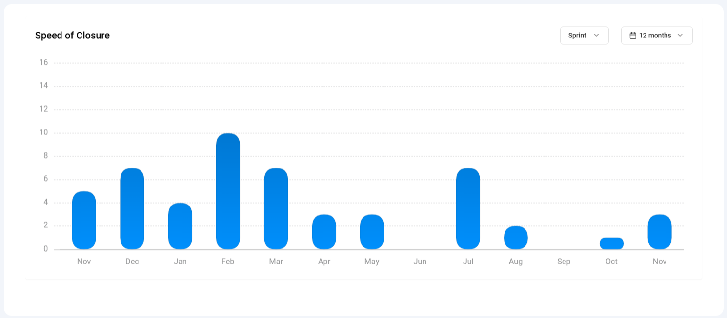
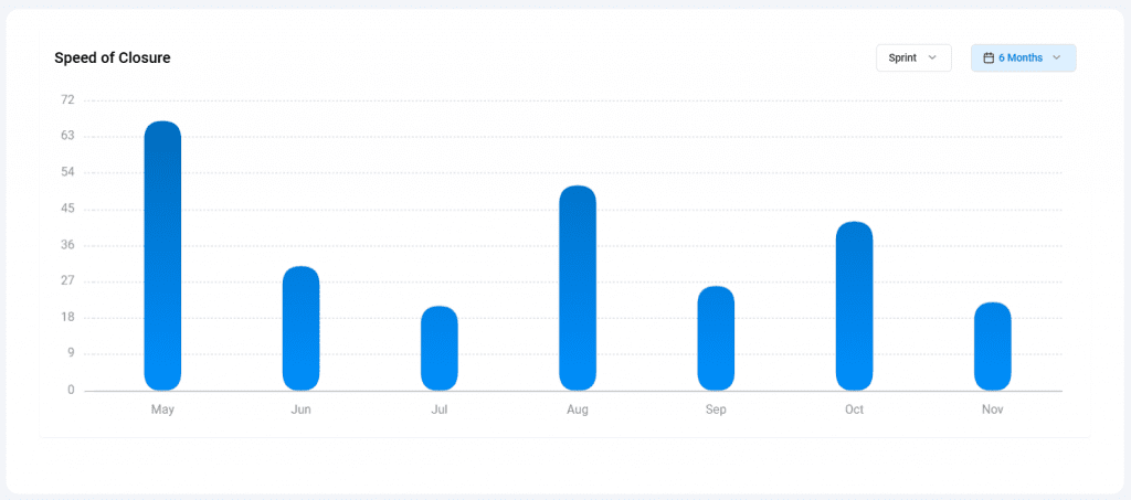
13)Speed of Closure: This graph provides insights into the count of issues closed over time, filtered by sprint and date. The graph shows days on the X-axis and the count of closed issues on the Y-axis. Only issues with a “closed” status category are considered.
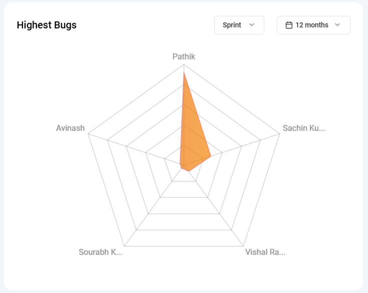
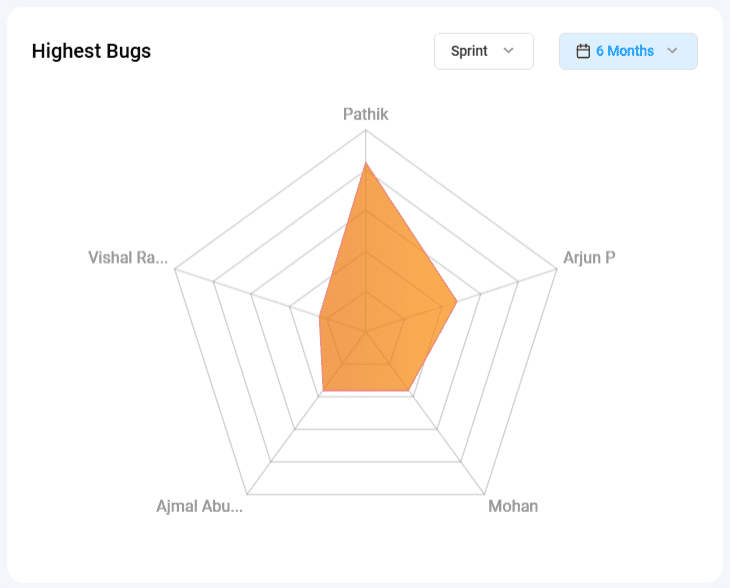
14)Highest Bugs: This graph provides insights into the count of open issues assigned to each team member, specifically issues in the “New” and “In Progress” categories. The widget allows filtering by sprint and date, enabling users to focus on specific time frames or sprints.
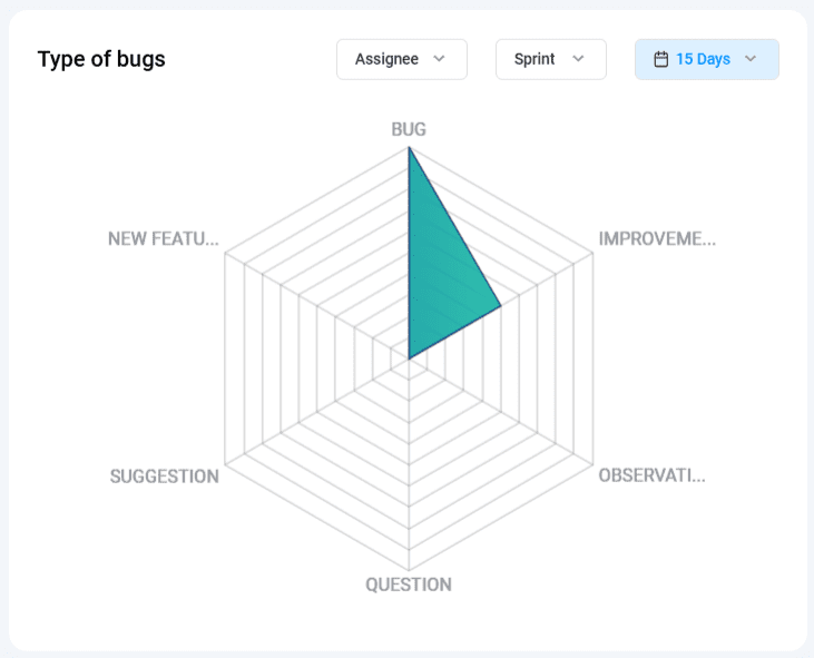
15)Type of Bugs: This graph provides insights into representing various types of issues (e.g., Bug, Improvement, Observation, Suggestion, etc.). The chart updates based on the selected filters: Assignee, Sprint, and Date.
Why Should you use Bugasura Project Dashboards
Bugasura Project Dashboard brings significant benefits to your project management abilities.
It drastically reduces time spent on manual tracking and analysis of your team’s work, enhancing overall efficiency. It also provides data-driven insights to improve project decision-making and issue resolution.
How to enable and use Bugasura Project Dashboards
To utilize the Bugasura Project Dashboard effectively, follow these steps
- Monitor issue workflows with the “Rate at Which All Issues Are Moving” chart.
- Identify issue-impacted project areas with the “Areas Impacted” chart.
- Prioritize older issues using the “Top 10 Ageing Issues” list.
- Analyze bug resolution times and improvements via the “Average Time to Close Issue” chart.
- Manage team workloads with the “Load Distribution Across Team” chart.
- Track the efficiency of critical issue resolution with the “Rate at Which Critical Issues Are Closed” chart.
- Make informed decisions based on issue severity distributions using the “Issues by Severity” chart.
- Optimize workflows by identifying status bottlenecks with the “Maximum Issues in Your Funnel by Status” chart.
- Enhance collaboration and communication with the “Top Issues with Most Activity” list.
- Prioritize issues based on severity with the “Average Time to Close an Issue by Severity” chart.
- Recognize your top team members through the “Top Members Reporting Issues” graph.
- Track team activity patterns with the “Most Activity” graph, highlighting daily engagement through comments on issues.
- Evaluate team productivity with the “Speed of Closure” graph, showcasing how quickly issues are resolved across sprints and timelines.
- Monitor individual workloads with the “Highest Bugs” chart, identifying open issues assigned to each team member.
- Gain insights into issue categorization with the “Type of Bugs” graph, breaking down issues by type to streamline prioritization.
Please note that these charts are automatically populated based on the usage of the tracker, sprints, and the number of team members in your project.