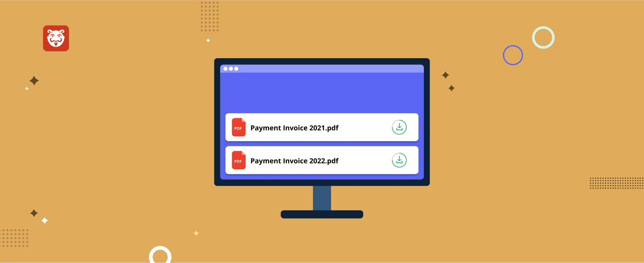
Previously, the invoice was displayed before you could make a payment, which was perplexing. As a result, the new invoice
The UI of the teams page has been revamped. The details about the Team is displayed in the form of
Now you can instantly see the new feature released for each sprint. You will see some highlights with short glimpses
The emails you receive from Bugasura can be personalized now. The email alert setup can be done at the member
We have introduced a left navigation pane that gives users a new way of exploring features in the product. This provides easy access
You can now add a customized App logo for your project from the left navigation pane for all the projects
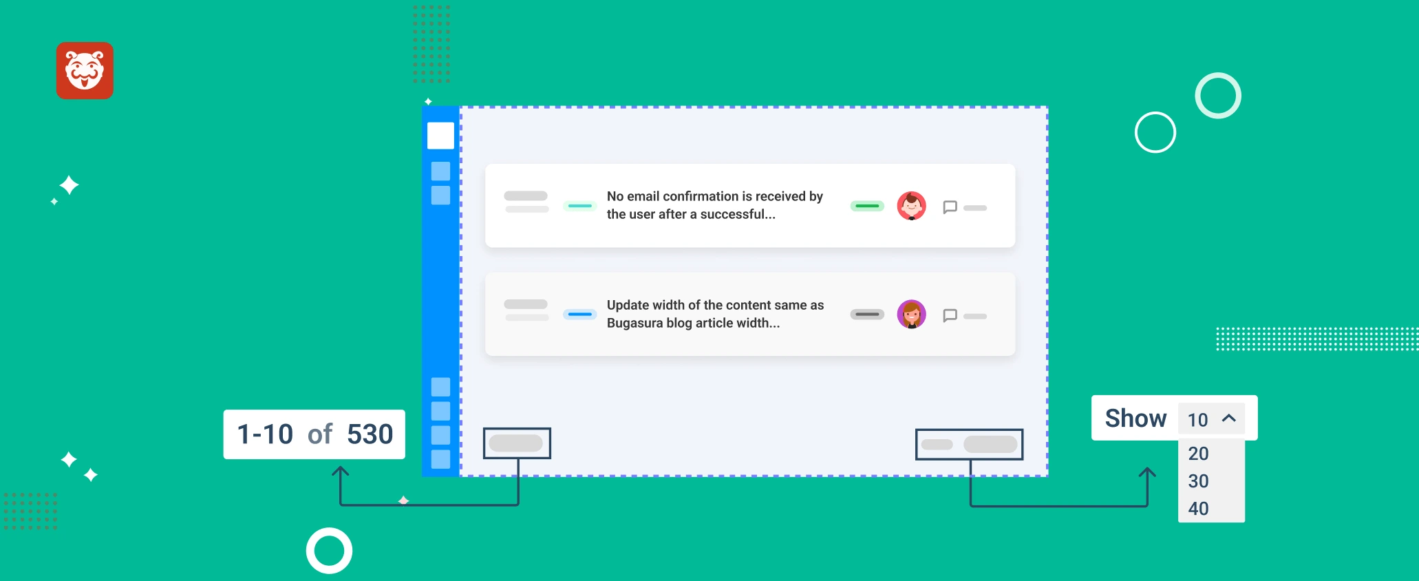
Now the range of issues on the issue list page can be varied. You can simply pick the number of
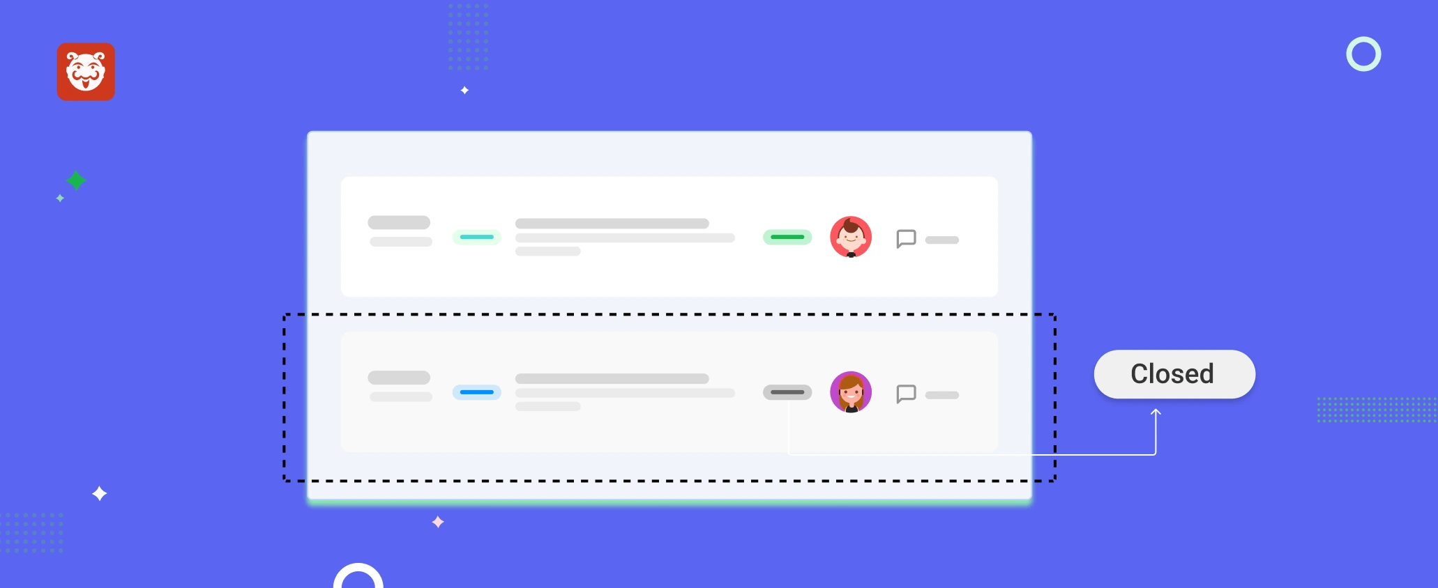
The issues under closed status are now differentiated from the open ones by highlighting them with a different color, which
With the new design improvements, managing subscriptions is now much easier. When you subscribe to one of our plans, you’ll
With the addition of advanced filters, we have now brought in the option to save filters. With this improvement, you

